Fair Weather Index
Everyone has a different idea of a good day. This one asks you for yours, then replays three years of real observations against it and tells you where on Earth it happens most.
The problem with a climate average
"Best weather" rankings almost always answer a question nobody asked: they average a year into one number, then rank places on it. That buries the thing people actually care about: how often is it genuinely pleasant, by my standard, and when in the year does that happen?
Fair Weather Index inverts it. You set the terms: temperature or feels-like, dew point, humidity, wind, gusts, rain, cloud cover, visibility. Every station-day in the archive is scored pass or fail against those terms, and the map paints the share of days that cleared them.
What you are looking at
The world lattice is 40,586 land dots at roughly 60 km spacing, held in longitude and latitude and projected fresh every frame. A row at latitude φ gets 360·cos(φ)/s columns, so every cell covers the same patch of ground wherever it sits. That equal-area property is what the whole app rests on. Without it, high-latitude countries would silently count for more, simply by being drawn larger.
Both world views preserve it. The globe is orthographic; the flat map is Equal Earth. Switching between them does not move the standings, because a dot means the same amount of ground either way.
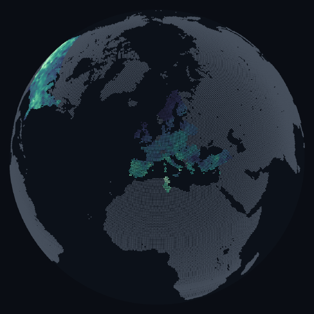
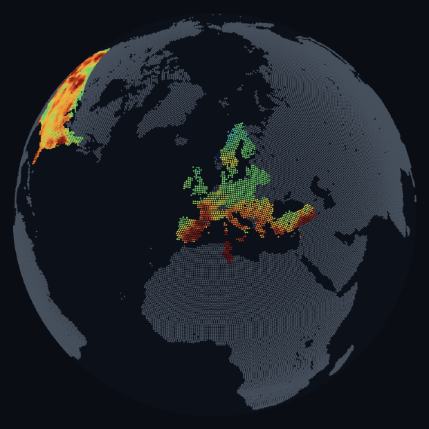
Grey means no data, not bad weather
The archive covers the United States and Europe. Everywhere else is drawn grey: it is land, it is not weather. The border between a coloured United States and a grey Mexico is where the dataset stops, not where the climate changes.
This is the decision the project is most opinionated about. Interpolating a colour across Africa from an airfield a thousand miles away would have produced a prettier map and a dishonest one.
Under the hood
2,281 stations were harvested and thinned to 961: the keeper in each cell of about
55 miles, chosen on an even geographic spread. The cell is sized in ground distance rather
than degrees, since a degree of longitude is half as wide in Norway as in Spain, and a
fixed-degree cell would have weighted Scandinavia double. Each reading is quantised to one
byte in obs.bin, laid out day-major so a single day's frame is one contiguous
read; 255 always means "not reported".
Dot positions come from precomputed sines and cosines, so spinning the globe costs a few multiplies per dot instead of four transcendental calls, and far-side dots are dropped on the sign of their cosine before anything else touches them. A separate preview script reuses the app's own geometry, ramps and scoring to rasterise the map to PNG without a browser, which is how an upside-down projection got caught in the first place.
Going in close
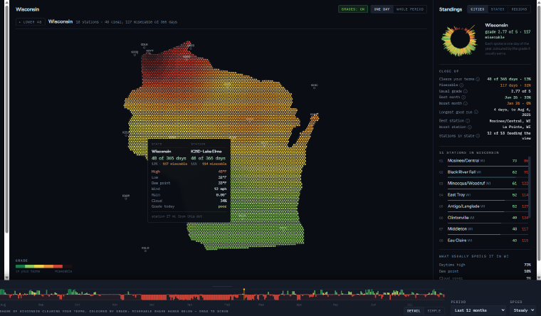
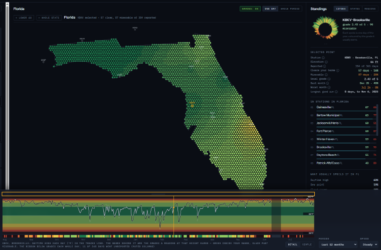
Click a country and the map rebuilds on a lattice for that country alone, using Lambert azimuthal equal-area centred on it, which works anywhere a conic tuned to one country does not. In the United States, where the source has subdivisions, one more click opens a state, and below that a click selects a single airfield.
What it will not tell you
Being straight about the limits is part of the design, and the app says so on its own pages:
- The dot field is interpolated from station points, not modelled. One dot is not a forecast for that spot; the tooltip names the station behind it and how far away it is.
- Feels-like is derived: heat index or wind chill computed from the daily summary, because the source carries no observed apparent temperature.
- No snow and no UV. The observations endpoint reports neither.
- European rainfall depth is estimated, learned from US rainfall. The dry/wet split is sound; the millimetres are a climatological expectation.
- Europe is harvested to about three fifths of its grid: the run stopped on a monthly token budget. Centres are worked in scattered order precisely so that stopping early costs a little density everywhere rather than an entire region.
- Role
- Design, data pipeline, and front end
- Data
- Xweather daily station summaries
- Period
- Aug 2023 – Jul 2026, 1,089 days
- Stations
- 961 after thinning, across 32 countries
- Stack
- Vanilla JavaScript, Canvas, Node build pipeline
- Hosting
- Caddy behind a Cloudflare Tunnel